HighNote Renaming & Rebranding
The Ask
The owners of Allegra Marketing Services had established a powerful reputation for outstanding service in the Louisville Kentucky region. But the executive team felt they had outgrown their franchise membership in a national network of 700+ similar businesses. The owners engaged Ray Ferreira, who partnered with Florville Catalyst, to deliver a new name and an empowering brand for this 25-years-strong business.
Project Scope
- Brand Discovery Research
- Regional Competitive Market Research
- Brand Name Development and Audience Testing
- Brand Manifesto and Communications Platform Development
- Brand and Identity Design, and Guidelines Development
- Direct Mail, Email, and Social Media Marketing Strategy
- Website and Customer portal Design and Development
- Brand Launch Vehicles across Digital and Traditional Channels
The Approach
Brand Discovery Workshop
From the beginning, the Louisville leadership team told us that they wanted a memorable and distinctive brand that would reflect their unique dedication to customer service as well as the aspirations of their most valued clients and influencers.
Through a team-workshop and a strategic client-interview process, we established the most highly valued aspects of the company’s culture, commitment, and integrity. Ultimately, we established a brand expression that would help buyers understand WHY they would want to engage the newly branded firm on their most important marketing communications programs.

Identifying a Differentiated Brand Experience
Three aspects of this Louisville firm’s story helped us define a differentiated and compelling brand story for targeted clients and prospects.
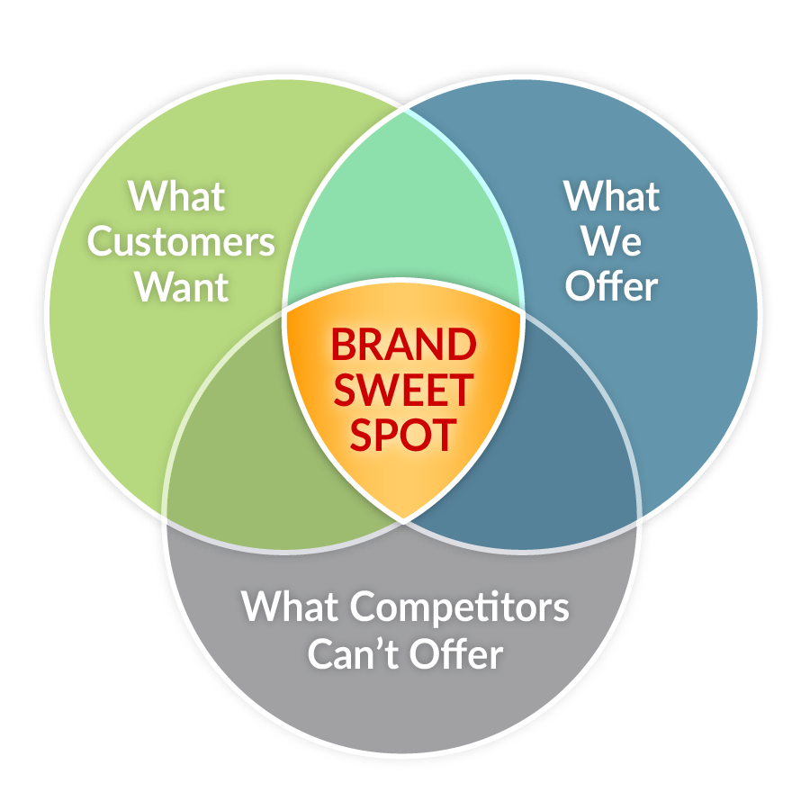
The Competitive “Sweet Spot”
By identifying the overlap of brand attributes that have helped the Louisville organization stand apart from competitors, we established brand’s most attractive and differentiating qualities… Its competitive Sweet Spot.
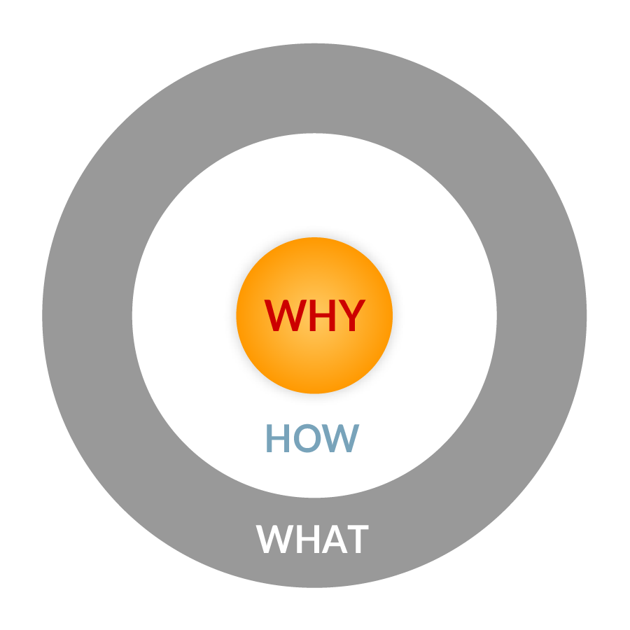
The Core “Reason for Being”
By listening for patterns in the ways that team members and customers described the company and its value, we established a story of WHY the company was so committed to outstanding client service and product quality.
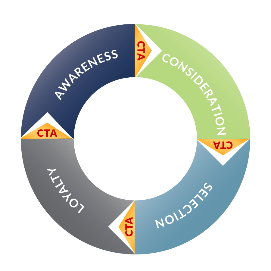
The Customer “Relationship Cycle”
The messages that drive the company’s cycle of Awareness, Consideration, Selection, and Loyalty helped us craft the language, tone, and calls-to-action that would become the brand’s messaging platform.

The Naming Process
Because the Louisville organization had a well-defined and cohesive culture, the executive team felt that a small group of key employees should be engaged in the naming process.
Through a series of team explorations and client/prospect interviews, three names emerged as strategic, unique in the marketplace, and intriguing among clients and prospects.
Based on findings from our client/prospect interviews the team selected a name based on the following criteria:
- Stopping Power
- Story Connectedness
- Curiosity Building
- Uniqueness
- URL Alignment
Building a Strategic Personality
A name, on its own, does not define a brand’s appeal.
Once “HighNote” had been selected as the new name, we needed to connect it with characteristics that clients told us they loved about their experiences.
The Brand Manifesto – a statement that would become the core expression of purpose behind everything the company does – told that compelling story of purpose for HighNote. This carefully crafted document demonstrated brand voice, helped buyers establish emotional trust, and aligned the passions of employees, customers, and business leaders.

Social Media Strategy
As part of the brand communications strategy, we identified the framework for the development of an effective digital ecosystem for HighNote. This included clarity around the people, process, and technology that could help the team operate an engaging inbound marketing program.
A careful review of HighNote’s target audience and media habits helped us identify the best channels and messages to help this new ‘experience brand’ build a virtuous cycle of engagement for its paid, earned, and owned media environments. Content objectives, by channel, and activity calendars were developed to help the HighNote marketing team build relevant and magnetic posts.
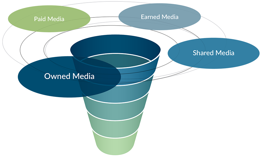
Next, we defined the layers of an inbound marketing funnel that would help marketing and sales teams watch for visitor engagement that signaled buyer intent. These signals would become the triggers for proactive contact with the goal of moving prospective buyers closer to a relationship with the HighNote brand.
The Solution
The HighNote Mark
Its expressive typography with an elevated magenta circle work well with the brand tagline — “Your Brand. Elevated.” — to create a sense of weightlessness that places the client (“Your Brand”) at the center of the company’s focus. The magenta circle would also provide a subtle clue to the company’s nationally-certified Women Business Enterprise status. In animated forms, the magenta circle would slowly rise from the logo’s baseline to take its place as a weightless element, representing the feeling of elation and confidence that customers had expressed during our research.
The HighNote Alternative Mark
For smaller or less-horizontal spaces we created an alternative mark. Here the magenta circle appears to push to the top of its vertical space, providing a sense of buoyancy.
The HighNote Die-Cut Mark
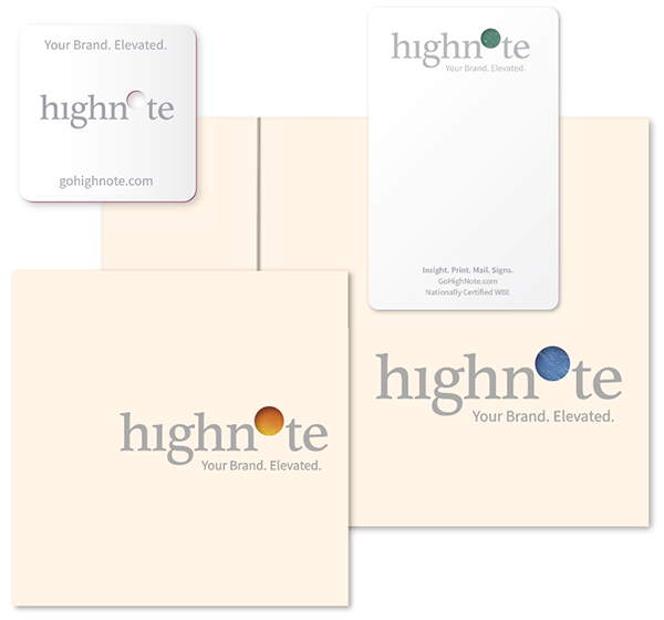
Standing apart has always been importsnt to this team. That’s why our Brand Guidlines define a die-cut version of the HighNote mark.
The die-cut mark enables a see-through lifted circle when there is an opportunity to reveal vibrant color or a brand image beneath. For the HighNote business card, this meant revealing the magenta core of a triplex paper. With notepads, folders, and brochures, it meant teasing a bright color or texture that would entice viewers to look within.

Brand Launch
Brand Launch
Three weeks prior to brand launch, a social media teaser campaign created regional visibility and curiosity. Three 17-second videos were pushed – on a weekly basis – into carefully targeted Facebook newsfeeds in the Louisville region. The three videos established curious anticipation with a click-through to a landing page called LiftingOffInApril.com (named to preserve the mystery). All visitors who arrived at the landing page were cookied to ensure they would see subsequent teaser videos as well as a fourth video, which revealed that “Allegra Louisville is now HighNote.” All promotions led audiences to GoHighNote.com once the launch date arrived.
Capabilities Carrier Folder
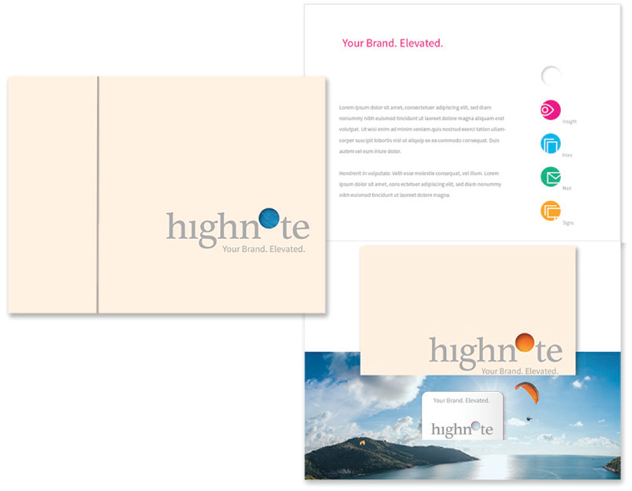
The die-cut logo of the HighNote Capabilities Carrier Folder offers a clue to the vibrant and energizing brand images contained within.
Copy on the inside-cover of the folder expresses HighNote’s purpose of serving customers through projects that are easier, better, and faster than they have come to expect from other firms.
The folder’s pocket delivers a Capabilities Booklet and a die-cut business card, with extra pocket space for other related documents.
Capabilities Booklet
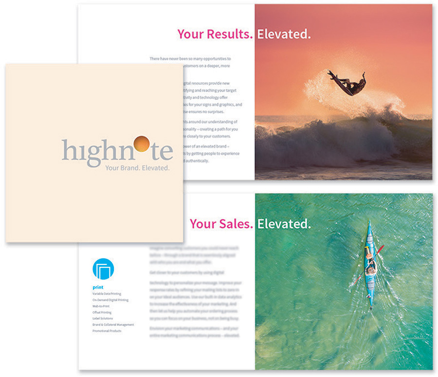
The Identity Brochure’s primary copy focuses on the customer priorities that the HighNote team will impact… “Your Vision; Your Strategies; Your Sales; Your Results; and Your Brand… Elevated.” This is the WHY for customers who work with the HighNote team.
Of secondary importance are the services offered—the HOWs—which are delivered as a sidebar captionon each spread.
Point of Contact
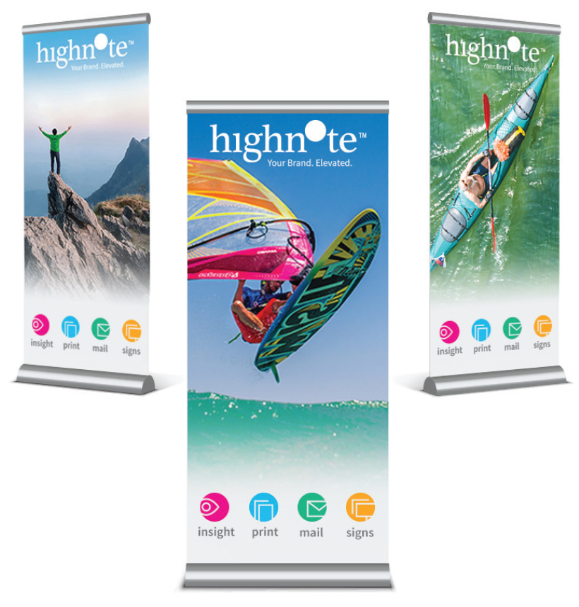
We wanted all incidental points-of-contact with HighNote to be memorable experiences. At events, seminars, and trade shows, the HighNote experience delivers exhilaration for viewers through vibrant, primary colors, high-energy activities, and clear expressions of the brand promise.

Out of Home | Outdoor | Around Town
For small to mid-sized businesses, like HighNote, seeing a delivery vehicle around town or at your employer’s loading dock is often a prospect’s first encounter with the brand. Our goal was to make that encounter visually memorable and alluring.
The angled logo, with its bold magenta dot, create the memorable visual impact. The four HighNote service icons create the allure for those who value “insight” in print, mail, and signs.

Event Swag
Diverse backgrounds with the HighNote Magenta Lifted Circle, create high visibility when prospects carry the brand around an event.
Delivering giveaways that are “keepers” — and don’t get thrown away when the prospect gets back to their office— is equally important.
The HighNote Brand Book
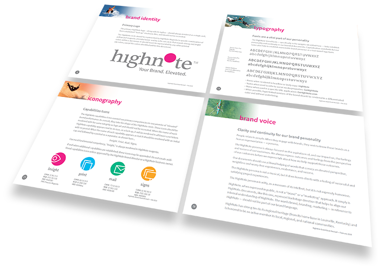
To ensure brand fidelity and continuity for the foreseeable future, we delivered the HighNote Brand Book. This digital and print-based tool provide easy access to brand usage guidelines covering logo placement and clear space, typography, iconography, aligned imagery, and core messaging standards.
Website
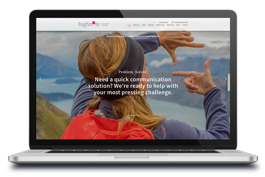
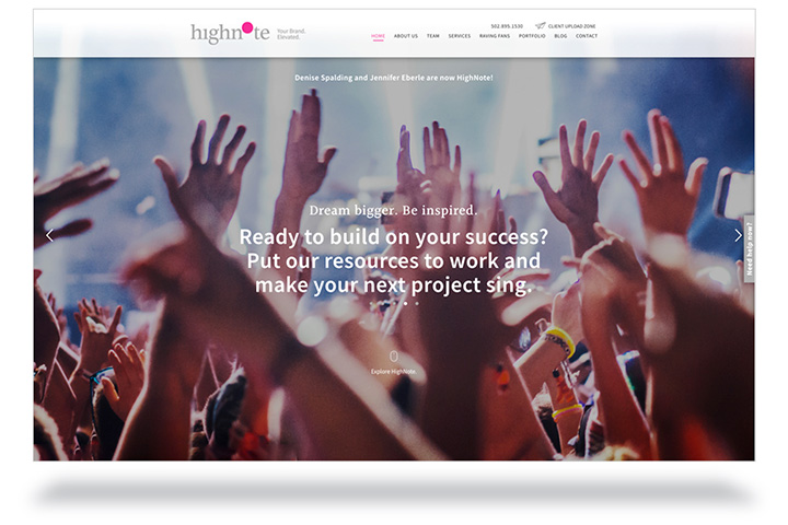
At the core of HighNote’s digital-first strategy is a responsive website that echoes all of the core brand messages. Imagery is selected to support a sense of height and elation. About Us includes a video message from the partners with text that expresses the company’s core purpose as expressed in its manifesto.
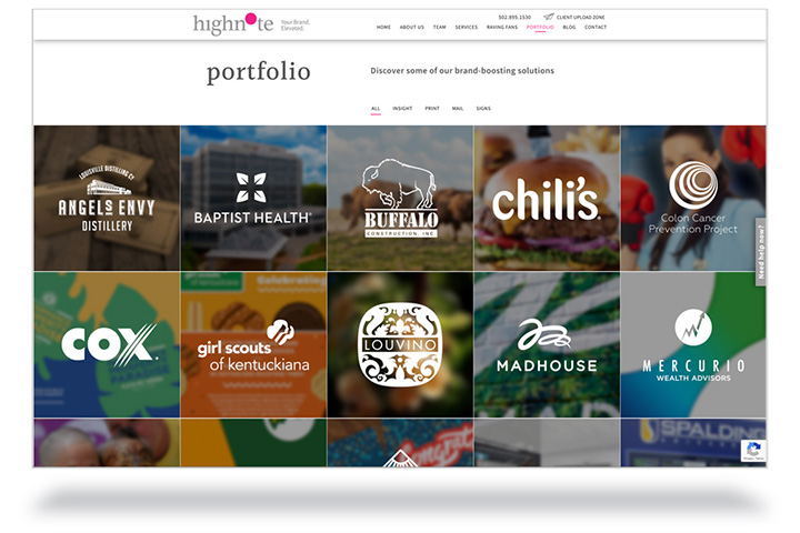
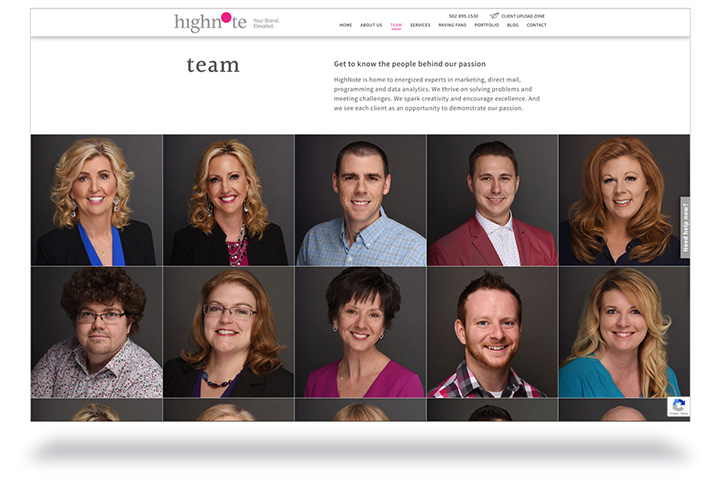
Users find numerous opportunities to meet the team, learn about the core services, review an extensive portfolio of top-notch work, hear what “raving fans” have to say, and explore a sortable inventory of informative blog entries.
Most importantly, prospects will find an opportunity to engage with HighNote at nearly every point of their visit while active customers can sign in and easily share documents through a “Client Upload Zone.”
The Outcome
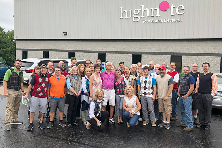
Transitioning their brand from its franchise constraints was an enormous undertaking for HighNote owners, Denise Spalding and Jennifer Eberle. Having spent over 25 years building strong customer relationships and an unmatched reputation for service, they couldn’t afford to squander their reputation as they created an independent brand identity.
For the HighNote team, the branding process was more than a new marketing initiative. It provided an aligning compass that everyone shared… Raving fans, employees, prospects, and influencers all felt the pull toward a purpose and promise that they could believe in and were proud to associate with.

Ray and his team helped our leadership team get to the root of the value our customers had come to know – and to rave about. They established strategic visual and narrative stories that helped customers trust that we were the same valued friends, but with a new name and look. And they developed an omni-channel communications strategy that launched our new identity with excitement and visibility.
Now, after several years of solid success, we’re thrilled to have achieved the continuity and growth we had been looking for. Our long-term customers see our brand as a confirmation of what they’ve known for years. And a new generation of customer relationships is growing quickly around a brand that helps everyone know how it feels to be in our diligent care.


Denise Spalding
President/Owner
HighNote

Jennifer Eberle
Vice President/Owner
HighNote